Engineering the new Monster Job View
Design Prototyping
After the Monster design and product teams validated a new direction for a "job view" refresh, I built a design prototype to discover and solidify technical requirements, break down the work, and deliver across two teams and two UI repos (our design system & the customer-facing website).
Technical Planning
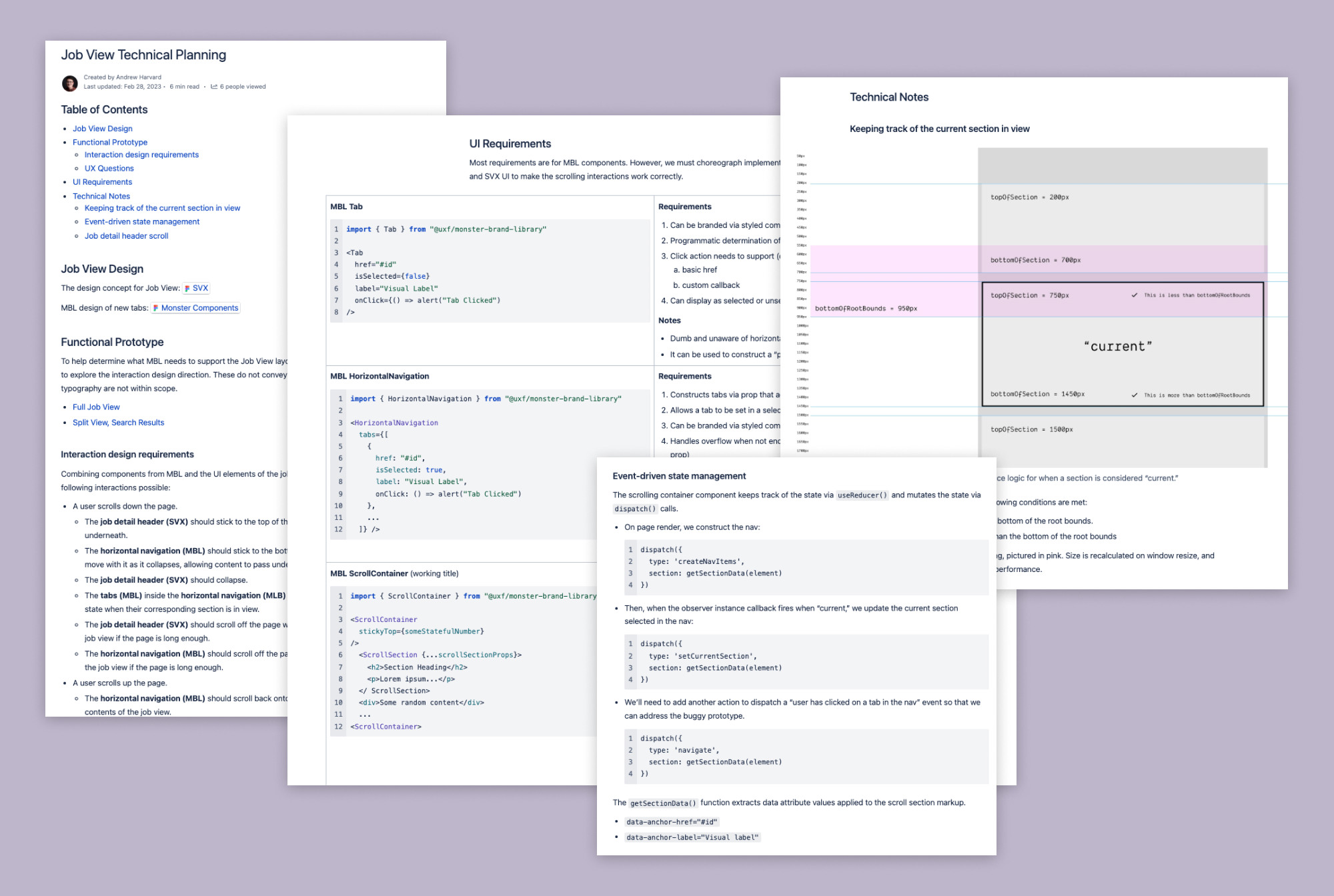
The prototype helped me identify patterns and drive technical planning conversations, which helped us batch and sequence the work. I wrote some docs that outlined what we needed to execute in our design system:
- Update the Tab component
- Update the Horizontal Navigation component
- Deliver new Scroll Navigation components
Each work item mentioned here was a team effort! While I took point on execution, I collaborated with our designers, incorporated feedback from other devs after code reviews, and fixed bugs found by our QA folks.
Execution
Tab Component Updates
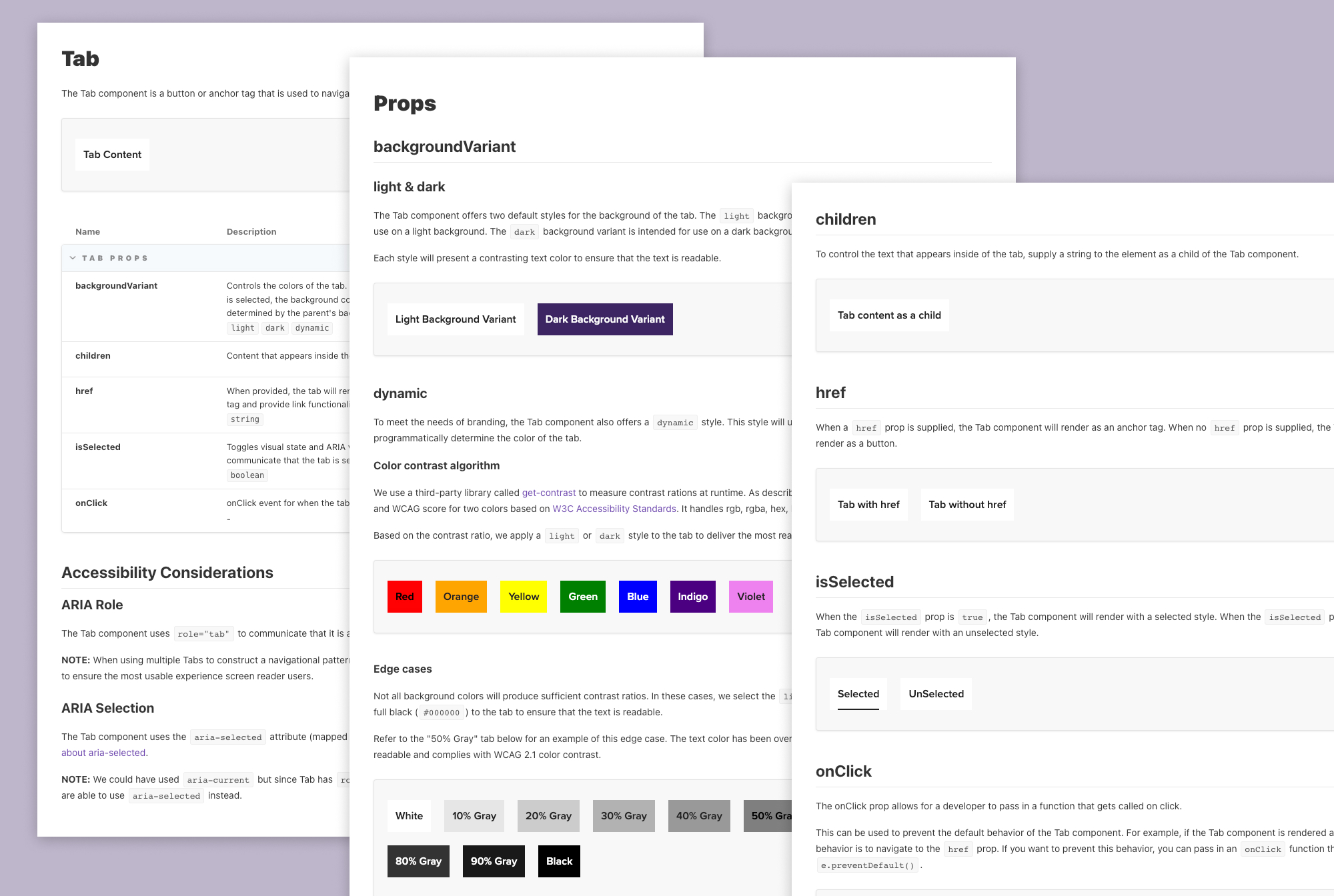
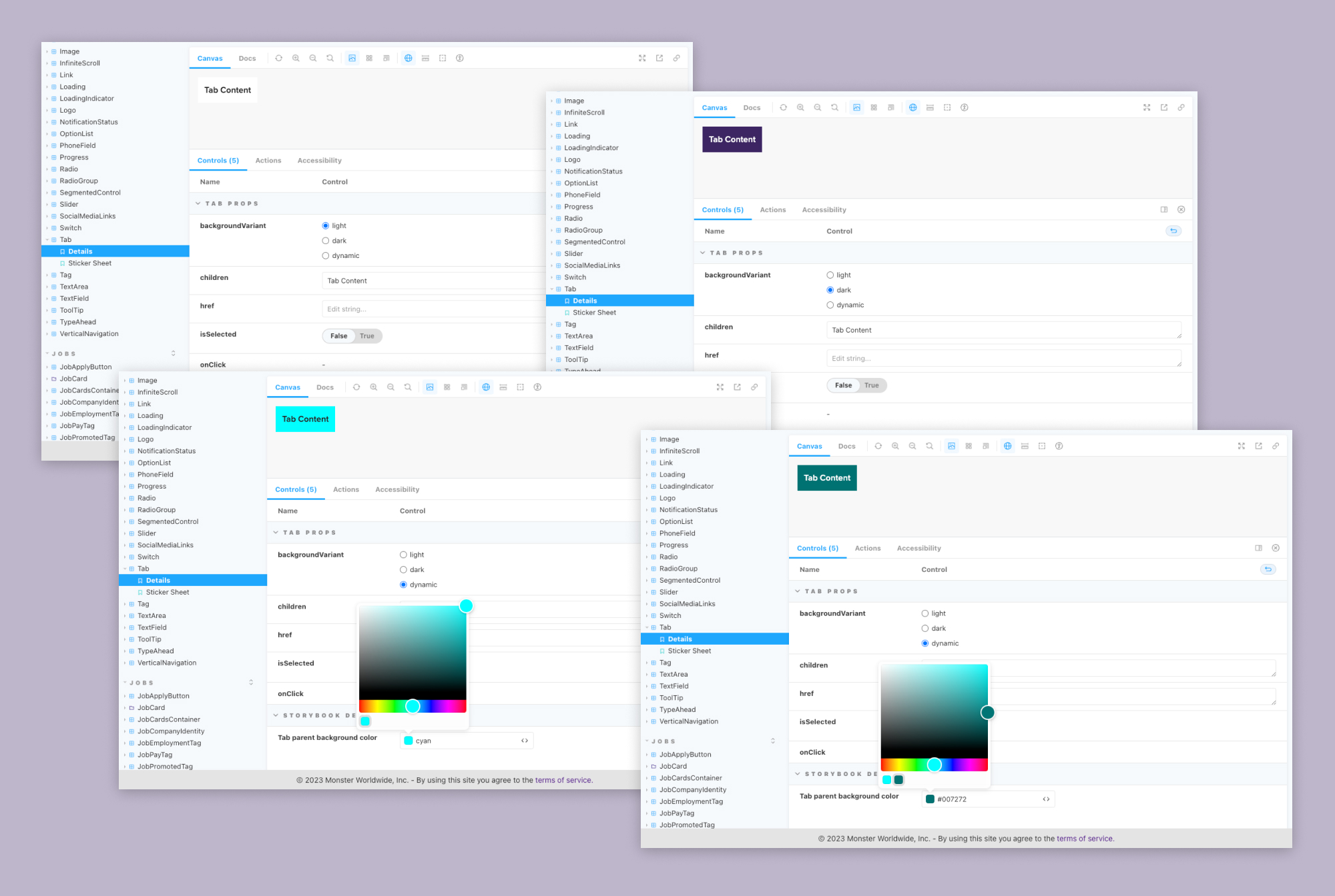
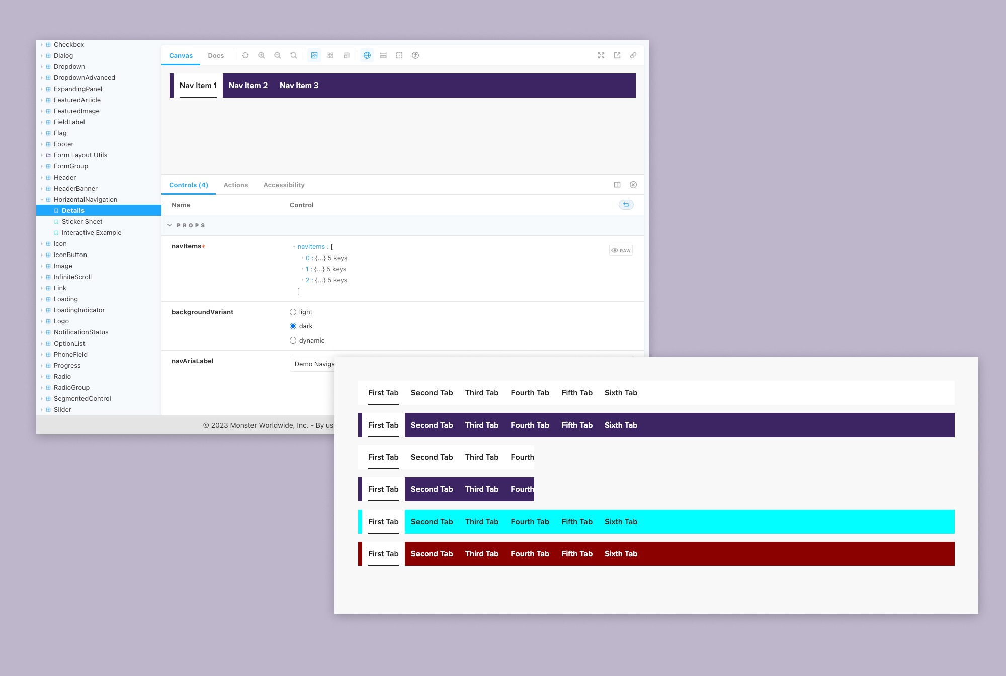
I updated the Tab component with a new look and feel and fixed some accessibility issues. Additionally, with the new design, a Tab can have a light, dark, or dynamic background. When dynamic is configured, the color of the label is calculated at runtime to achieve sufficient color contrast.
Horizontal Navigation Updates
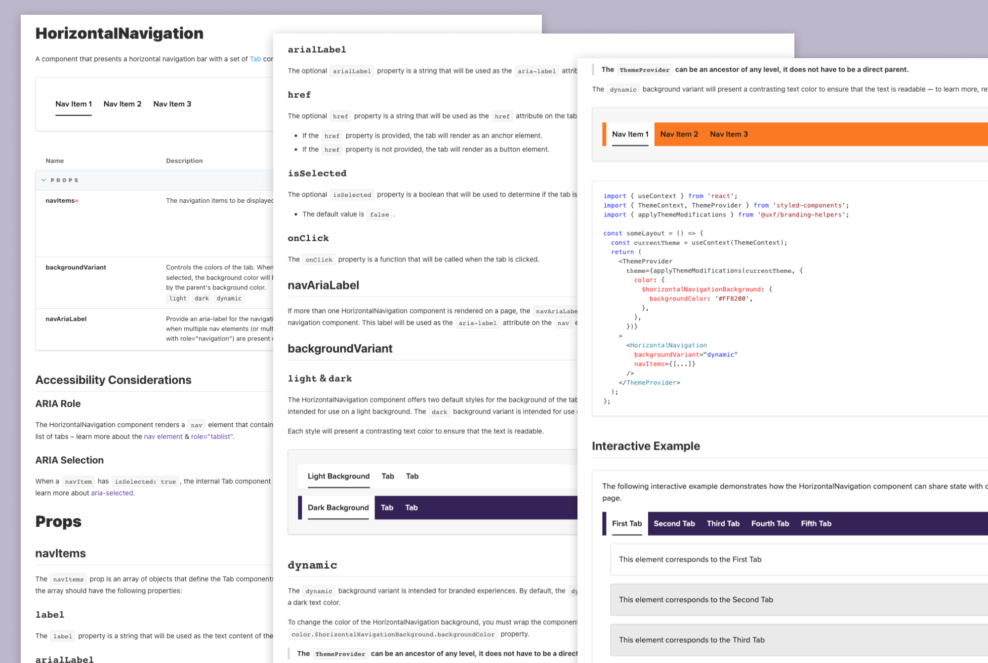
Next, I refactored the Horizontal Navigation component to leverage the updated Tab component. Previously, this component lacked semantic markup and did not provide the most accessible UX. I maintained backwards compatibility while also extending this component to allow Tabs to be constructed from a single prop that expects an object.
New Scroll Components
The trickiest part of this work was identifying how we would deliver the scrolling UX from the design system. Without prototyping, my team likely would have spent more time iterating during delivery cycles than we could afford.
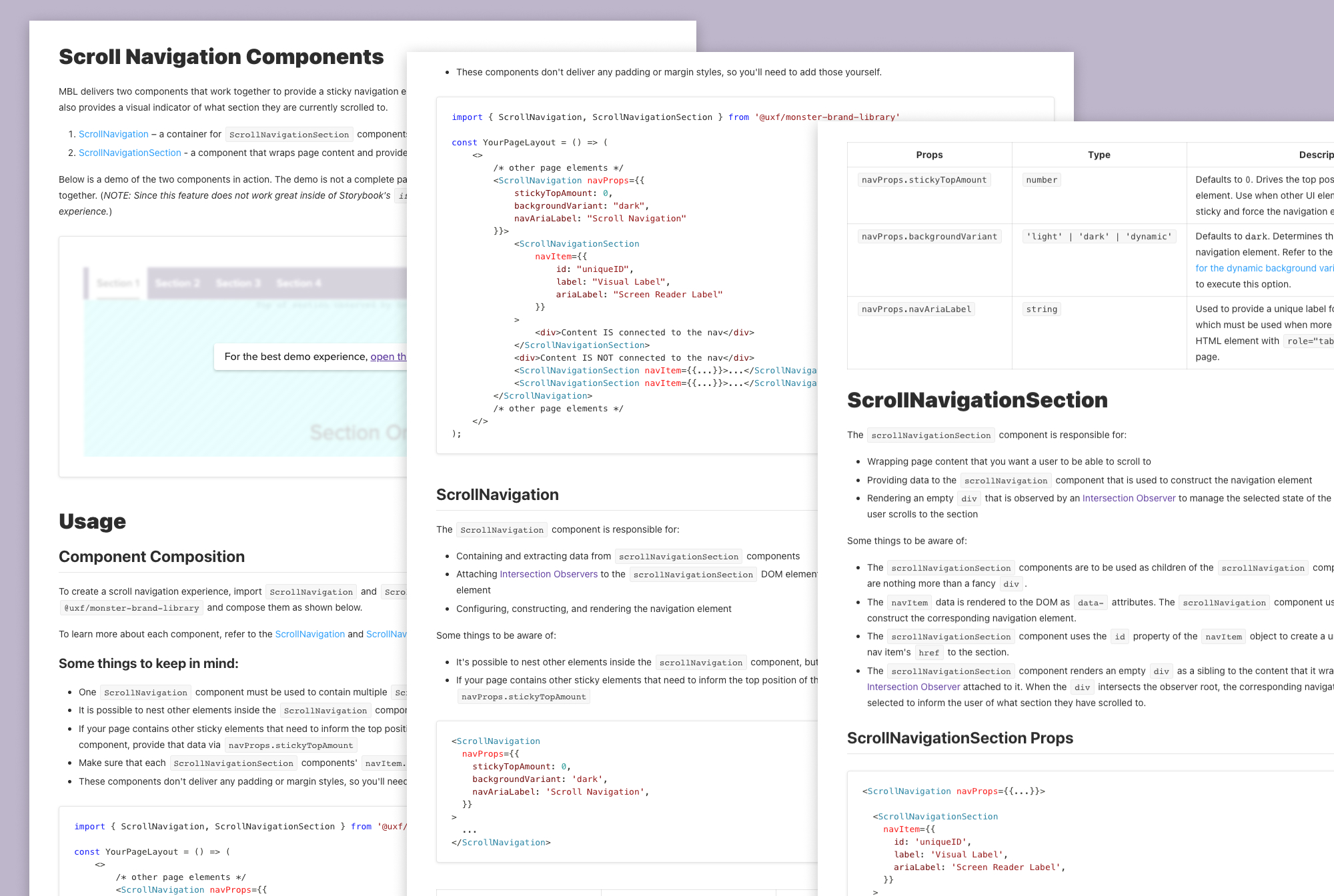
I advocated for us to abstract away as many implementation details for developers so that our design system has more control over how this experience evolves. So, I developed two new components for this part of the work to deliver a scrolling navigational experience.
The Scroll Navigation component wraps all of the page content where we want to provide a scroll-based navigational experience. This component allows a developer to configure which nav element to display. Out of the box, this component renders the Horizontal Navigation. This means developers don't have to import and connect the Horizontal Navigation to the user's scroll.
The Scroll Navigation Section component wraps content sections within the parent and drives the Tabs' content in the Horizontal Navigation.
To make things work as intended, I used the Intersection Observer API and wrote a simple state-machine reducer to track the "active" section in view.
Ongoing Challenges
Due to browser performance issues and time constraints, we could not deliver the initial design ask — when a Tab overflows the Horizontal Navigation, it should scroll into view when it becomes active.
To drive conversations with our product and design partners, I put together the following deck to illustrate the issue and proposes alternative directions.
Currently, we're having conversations about how to meet the initial design ask and considering the following options:
- Ship MVP and do nothing
- Spend an unknown amount of time engineering a solution that meets the design while being performant in the browser
- Spend a solid chunk of time delivering some new reusable components that we can use to make the responsive UX better
Conclusion
I suspect we may resort to shipping the MVP. However, knowing that other options exist is valuable, and we will likely be able to fall back on them as we get real feedback from users.